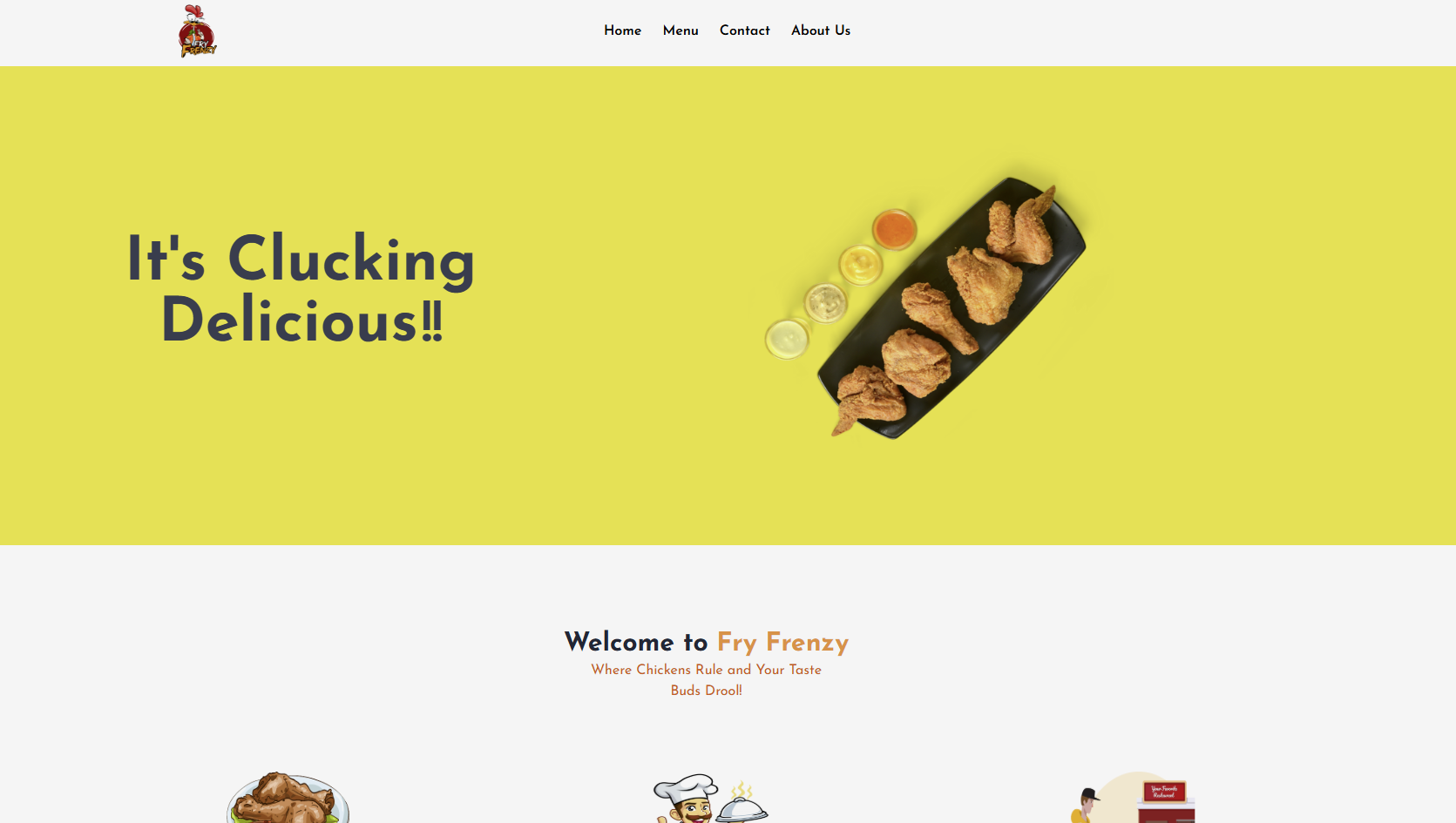
Fry Frenzy Restaurant
Rapid development of a restaurant website with online ordering, mobile-first design, and performance optimization.
Technical Challenges
Fry Frenzy needed a complete website with online ordering capabilities delivered in just 7 days with high performance and mobile optimization.
Key Technical Problems Identified
- ✗Tight deadline requiring rapid development
- ✗Mobile-first design for restaurant customers
- ✗Online ordering system integration
- ✗Performance optimization for food images
- ✗SEO optimization for local search
Technical Implementation
Delivered a complete restaurant website with online ordering in record time using modern development practices.
Architecture & Technology Stack
Frontend Technologies
- Next.js 14 with App Router
- Tailwind CSS for rapid styling
- TypeScript for reliability
- Framer Motion for animations
Performance & Optimization
- Image optimization with Next.js
- Static generation for fast loading
- Mobile-first responsive design
- SEO optimization with metadata
Key Implementation Features
Rapid Development
Built complete website in 7 days using Next.js and Tailwind CSS for rapid development.
Mobile-First Design
Created mobile-optimized interface for restaurant customers on-the-go.
Online Ordering
Integrated online ordering system with cart functionality and checkout flow.
Performance Optimization
Achieved 95+ Lighthouse scores with optimized images and fast loading.
Performance Results
Delivered high-performance restaurant website optimized for mobile users and fast loading.
Before Optimization
After Optimization
Key Achievements
Technical Implementation Highlights
Rapid Component Development
Created reusable components with Tailwind CSS for fast development.
// Restaurant menu component
import { useState } from 'react'
export function MenuItem({ item, onAddToCart }) {
const [quantity, setQuantity] = useState(1)
return (
<div className="bg-white rounded-lg shadow-md p-4 mb-4">
<div className="flex justify-between items-start">
<div className="flex-1">
<h3 className="text-lg font-bold text-gray-900">{item.name}</h3>
<p className="text-gray-600 text-sm mt-1">{item.description}</p>
<p className="text-yellow-600 font-bold text-lg mt-2">${item.price}</p>
</div>
<div className="ml-4">
<img
src={item.image}
alt={item.name}
className="w-20 h-20 object-cover rounded-lg"
/>
</div>
</div>
<button
onClick={() => onAddToCart(item, quantity)}
className="w-full mt-3 bg-yellow-500 text-white py-2 px-4 rounded-lg hover:bg-yellow-600 transition-colors"
>
Add to Cart
</button>
</div>
)
}Mobile-First Responsive Design
Implemented mobile-first design with Tailwind CSS breakpoints.
// Responsive layout component
export function RestaurantLayout({ children }) {
return (
<div className="min-h-screen bg-gray-50">
<header className="bg-white shadow-sm">
<div className="max-w-7xl mx-auto px-4 sm:px-6 lg:px-8">
<div className="flex justify-between items-center py-4">
<h1 className="text-2xl font-bold text-gray-900">Fry Frenzy</h1>
<div className="flex items-center space-x-4">
<span className="text-sm text-gray-600">Order Online</span>
<button className="bg-yellow-500 text-white px-4 py-2 rounded-lg">
Cart (0)
</button>
</div>
</div>
</div>
</header>
<main className="max-w-7xl mx-auto px-4 sm:px-6 lg:px-8 py-8">
{children}
</main>
</div>
)
}Ready to Work Together?
Let's discuss how I can help transform your digital presence and drive meaningful results.